 Kevin McComas
02 · Lead UI Designer
Redesigning Onboarding for a Privacy-First Messaging App
Redesigning onboarding for a privacy-first messaging app without weakening its self-custody model.
Overview
Satellite was a privacy-first, censorship-resistant messaging app built around people owning their own identity, their own data, and their own account recovery. It was made for people who care a lot about privacy. The hard part was that the security model, as good as it was, asked a lot of anyone who wasn't already fluent in crypto-style recovery.
As Lead UI Designer, I redesigned the onboarding flow across Satellite's desktop and mobile apps. The goal was to make account creation feel familiar to people without recovery-phrase experience, without weakening what made the product private in the first place.
The original flow put a recovery phrase in front of people almost immediately. Recovery phrases are second nature if you live in crypto, but they're unfamiliar to just about everyone else. When I sat people down to actually use it, the confusion showed up before they'd even finished making their account.
So the redesign flipped the order. Familiar setup steps came first, the recovery credentials got generated quietly in the background, and recovery itself got reframed around an encrypted, password-protected file. Advanced users could still get to the raw seed phrase if that's what they wanted. That version shipped publicly on both desktop and mobile.
My Role
Lead UI Designer. I owned the onboarding redesign from the first scrappy usability observations all the way through design exploration and developer handoff. That looked like:
- Running lightweight moderated usability sessions with non-technical friends and family
- Mapping out the original onboarding flow, step by step
- Finding the exact moments where account creation lost people
- Designing the revised flows and screens in Figma
- Writing implementation tickets for engineering
- Working closely with the developers to brainstorm and pressure-test solutions
- Keeping ease of use, privacy, decentralization, and self-custody all standing at the same time
This was more than a visual update. The recovery system was wired straight into the app's decentralized architecture, so the fix meant working closely with engineering to figure out what could actually move, what had to stay put, and how much complexity we could keep out of the user's way early on.
The Problem
The original flow made sense on paper. It just showed people the most complicated part of the product first. Roughly, it went:
- Open app
- Create account
- Get a recovery phrase
- Write down the recovery phrase
- Make a username and PIN
- Add a profile picture, banner, and bio
If you've used a crypto wallet, that order feels totally reasonable. If you haven't, it asks you to make sense of the highest-stakes part of the app right away. Watching people test it, they'd stall out on the recovery phrase screen and ask the same handful of things:
“What do I do with this?” · “Where do I save it?” · “Do I need this every time?”
That told me it wasn't just a copy problem or a layout problem. The real issue was that we were asking people to understand a technical recovery model before they'd built any mental model of the product itself.
The word “PIN” added to the mess. The app said PIN, but the field really behaved like a password. That little mismatch left people unsure what they were even creating, how careful they needed to be with it, and how it related to that recovery phrase. The product was leading with its architecture when it should have been leading with what people already expected.
Research Approach
Satellite was built around privacy and minimal tracking, so watching people through analytics or behavioral tracking was off the table on purpose. There also wasn't a formal research budget to lean on.
So I kept it small and hands-on: lightweight moderated sessions with non-technical friends and family. I'd hand someone the app, ask them to give it a go, and watch for where they hesitated, misread something, or looked to me for help.
That group gave me exactly the kind of feedback I needed. A lot of them weren't technical or crypto-native, so they wouldn't quietly work around a rough edge the way a power user might. If something was confusing, it showed immediately. The seed-first recovery experience was what tripped everyone up. People understood the familiar parts: pick a username, set a password, add some profile details. What they didn't understand was why they were being handed a long recovery phrase before they'd even used the app.
The Insight
The recovery phrase mattered. It just didn't need to be the first thing anyone consciously dealt with. The old flow treated “technically transparent” and “clear to the user” as the same goal. In practice, showing the recovery phrase that early made the whole app feel more intimidating and less familiar than it needed to.
The opening was to keep the self-custody model exactly as strong as it was, and only change when and how people ran into the complexity. The principle I kept coming back to:
Show the complexity when it becomes useful, not before someone has any context for it.
Design Goals
The redesigned flow had to:
- Make the first few steps feel familiar to people without crypto experience
- Take the confusion out of account recovery
- Avoid centralizing recovery just to make life easier
- Keep the privacy and censorship-resistant model intact
- Leave the advanced recovery options right there for technical users
- Work cleanly across both desktop and mobile
Which meant the answer couldn't just be “make it like every other social app.” Satellite had real security and decentralization requirements that weren't going anywhere. The job was to make that model easier to understand and follow.
The Redesign
The new flow moved the familiar account-setup tasks up to the front. It became:
- Open app
- Create account
- Choose a username
- Create a password
- Add a profile picture, banner, and bio
- Generate recovery credentials in the background
- Offer recovery through an encrypted, password-protected file
- Keep the raw seed phrase available for advanced users
Instead of opening with a recovery phrase and a high-stakes save-this-now moment, the app started with the patterns people already knew from social and messaging products. You could build an identity first: username, password, profile photo, banner, bio. That alone made the whole thing feel familiar and lowered the amount of technical context you needed just to get going.
The bigger move was pushing seed generation into the background. Technically the seed could still be created first. The difference was that you no longer had to babysit a list of recovery words before you'd even finished setting up. Recovery got reframed around an encrypted, password-protected file. Lose access or want to sign in somewhere else, and you'd use that file plus your password instead of hand-typing a long phrase.
And the raw seed phrase was still there for anyone who wanted direct control. It just stopped being the default hurdle everyone had to clear.
Before and After
Before
The flow put technical recovery ahead of familiar account creation. People were asked to save a recovery phrase before they had any context for what it was, why it mattered, or whether they'd need it every single time they logged in. That bred hesitation right out of the gate. The “PIN” label made it worse, since the interface language and the actual security behavior didn't match.
After
The flow put the user's confidence first. People started with familiar setup steps while recovery credentials were quietly generated in the background. The system stayed fully self-custodial, but the default recovery experience got a lot easier to grasp through that encrypted backup file. The raw seed phrase was still available for advanced users. It just wasn't the first big idea every newcomer had to wrap their head around.
Working With Engineering
Because onboarding was tied straight into Satellite's account architecture, I was in constant contact with the developers through the whole redesign. I'd build the screens and flow diagrams in Figma, then use those to talk through implementation options with engineering. We dug into how to keep the security model whole while pulling complexity out of those critical first few minutes.
I also wrote up implementation tickets so the work could be broken into pieces the team could actually pick up and ship. The final direction came straight out of that back and forth: keep the recovery seed as part of the underlying account system, but stop letting it be the first wall a new user runs into.
Outcome
The redesigned onboarding shipped publicly across Satellite's desktop and mobile apps. Since the product was built around privacy and minimal tracking, there wasn't an analytics-heavy funnel to measure. I went back to the question that started the work: did the new flow clear up the confusion I'd watched people run into? The redesign helped:
- Take the conceptual friction out of account creation
- Make the app feel familiar to people without crypto experience
- Clear up the difference between passwords, recovery files, and seed phrases
- Keep account recovery decentralized
- Avoid centralizing recovery for the sake of convenience
- Bridge the gap between privacy-first technology and what everyday people expect
The part that mattered most was that people no longer had to understand a crypto-native recovery model just to make a basic account. The app stayed private and self-custodial, while the first run felt like a normal onboarding flow.
What I Took Away
This one shaped how I think about designing for privacy-focused products. A security feature only counts if people can actually understand it and finish it. In a product built on decentralization and censorship resistance, the right move isn't always to copy the convenience patterns of the big centralized apps. Sometimes it's to keep the underlying model exactly as it is and just change how and when someone bumps into its complexity.
The onboarding redesign was never about making Satellite less secure. It was about making the existing security model easier to understand and use.
Visual Notes
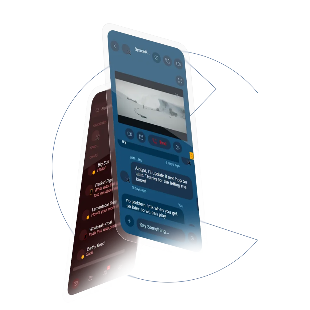
The screens here are early Figma explorations from the onboarding redesign. The version that actually shipped kept evolving through the work with engineering, but these show the core direction: the flow changes, the reframed recovery, and the usability calls that carried through to the desktop and mobile release.